Friday, December 31, 2010

Stairway: Final images

These images were taken at 1 AM, before I stumbled out to get pick-pocketed on the subway (that is not a joke, unfortunately....)


The Stairway: Zero hour


Step 4

It's now almost midnight, and we're up the final stage.
There's an electric cord running all the way across the top part of the back wall. The principle wanted to know if there was some way we could run it into the mural.
I decided to make the wire into a trellis: this would make it's three dimensionality, the fact that i t stood in front of the mural, into an asset rather than a liability. It also allowed me to integrate the mural with the stair railing: the trellis would be connected to the corner of the railing.

Here is the wire, covered with painters'-tape to keep in clean:

Now we transform it into a trellis:


Here is a close up:


The Stairway--working against the clock!

On to one of the busiest days of my life!
I decided to keep the basic color scheme of warm adobe shades we had discussed--let it be a sunrise landscape. This would keep the colors harmonic and relatively simple, and still get the lovely effect of green plants against oranges and yellows.
I stopped on my way to NYC at a Wal Mart and picked out two basic shades of wall paint, to lay in the background.
Then, since these walls were much smaller than the synagogue walls, I decided to go for the indulgence of high-quality acrylic paint. The colors were much richer and deeper, and when watered down, dried almost instantly, leaving no fumes. Considering the time frame, it seemed a worth while investment.
I got flow medium, as well as a gel, to allow me to stretch the paint further. By building up in thin, almost watercolor-like layers, I actually managed to cover the full two walls, while still having some left-over paint.


Step 1
The walls were unprimed, with concrete bricks (like the classroom), and dirty. The first thing I did was cover the dirty white of the walls with some basic layers of house paint. I made the top sky area a paler orange-yellow, and laid in the bottom field in a warm ocher.
Luckily the professional painters were still in the school, and one very gallantly did the whole top for me--it was like magic. Within 10 minutes he had it laid in with almost no cracks, and I didn't have to climb the ladder (which I hate--especially when I'm hanging over a 3 story stairway).
Kudos to Manuel, wherever you are!

Step 2
In stage 2, I worked over the basic sky-earth colors with watered down acrylics, to create a delicate, modulated effect. I added lots of layers of tones to the sky to create the impression of sunrise, warming up the edges with red and deeper oranges, and lightning up the area where the sky meets the earth with whites and yellows.


Then, in thinned down orange-green, I sketched in where the trees would go against the sky, and the furrows of the fields. I made the perspective vanishing point near the corner between the two walls, so that the shape of the room would work with the picture rather than against it.
I modulated the ocher color of the field with warm browns in the shadows, and different shades of green to highlight how the fields are moving back in space.


Step 3

Finally (by now it was late at night and I was alone in the school--I ran out to Starbucks for some comfort drink), I came in with the thick paint and put in the foreground: big flowers, painted in in pale shades of yellow. I dotted these with less and less detail moving back in space.
By now the paint was heavy and wet, and it was hard to get the right amount of definition.


Stairway--YRSRH Elementary School

In the course of my work on the Tefillah room, I became a sort of unofficial advisor on matters related to the refurbishment of the school.
On area that particularly bothered the principle was the top of the main stairway leading into school. It had a small corner area to the side of the door that was wasted space. She wanted to change it to make the entrance more inviting.
We thought of a small seated area, but felt that the space was too narrow.
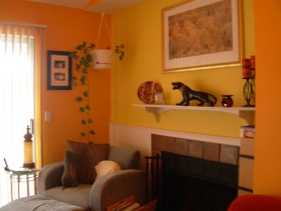
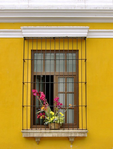
Then we thought of putting plants there, and making it a small in-door garden. I suggested painting the walls in two or three warm adobe shades, just to provide some contrast--something like this effect:


Or this:


I thought this was settled--a nice, relatively easy way to brighten up the room. The school had to be repainted anyway, so it would not come at any extra cost.
Then the principle called me to say she had changed her mind, and would prefer to have a mural there as well... A landscape, like the back wall of the synagogue, to expand the space, and run in with the plants.
All very exciting--but it had to be finished and dried before school started--and I only got back to New York 2 days before the start of school!

Wednesday, December 15, 2010

Finished Synagogue in Yeshiva of Rabbi Samson Rephael Hirsch girls' elementary school


Here is the room after all three walls were finished.
Once the murals were finished, the school refurbished the room by buying new chairs and redoing the window shades:


Tefillah room at Breuer school, Part II


After I finished the first mural, the school decided to take down an old bulletin board that covered the adjacent wall. This ended up turning a small project into a full-room affair.
The wall was badly damaged--full of holes where the bulletin board had been hung, and old bright yellow paint. The parents asked me to find a way to make it work with the mural, while still keeping the picture wall distinct.

Wall 2
I suggested sponging it in with the shades used for the sky in the mural-- pale purple on the bottom, which slowly transforms into a deep blue. This kept the second wall both simple and airy, and framed the mural nicely.


The front wall
Originally we had planned to put a simple inscription on the front wall, which would mostly be covered with bookshelves.
At the last minute, the principle decided against putting in bookshelves, and this set into place the final transformation of the room.
The principle thought that the front wall ought to be the most important. It was the wall that would be faced during prayer. She wanted another mural, and one that would strongly define the room as a synagogue. She suggested a picture of the Western Wall, with people praying.


The parents' committee were afraid that two murals would make it feel claustrophobic, and over-done.
I tended to agree. I felt that a painting of a wall would create a sense of enclosure--the exact opposite of the sense of space and air we had tried to achieve with the landscape. I also felt that a second, highly detailed figurative mural would push the project beyond the budget.

I suggested playing on the sky theme we had established with the second wall, while making the front wall echo the shape of the Torah ark that usually stands at the front of a synagogue.

Thus was born our Mizrach wall. Here is a close up of the "shaar haShamayim"--the heavenly gate. I used a projector to get the lettering aligned and centered. The verses where chosen by the parents.


Here is the front wall in the process of being painted:


Using the same color scheme as the other walls helped keep the room unified, and also allowed us to stay within the budget, by making use of leftover paint.

Tuesday, December 14, 2010

My first mural, 2005

After decorating my nieces' bedroom in Beit Shemesh, a neighbor asked me to paint a landscape in the corner of her children's bedroom.
It was exciting--and terrifying. It was the first time I had worked on anything that big, and I was working with a hodge-podge of supplies: the various wall-paints that had been left over from her work in the house, combined with acrylic and craft paints from children's projects.
I used a mixture of rags, sponges, and house brushes.
Still, the handicaps ended up making it freeing and fun, with elements being added in as the kids asked for them. We also really enjoyed running the mural in with the bedroom furniture!


Posted by Picasa

Early work: fairies flying everywhere


These are from 2005. I first became interested in murals when my nieces asked me to decorate their room with fairies.
I call these little paintings "wall decorations." I enjoy the way they play with the architectural elements of the room.


Close up

Here is a close-up of the olive tree. It is close to life size.Posted by Picasa

Pictures of the Kever Rachel Mural in Tefilla room


Here one can see the mural still in process, with the painters tape still on the wall:

This is while I was working up the detail on the tree, which is close to life-size:


The First Mural for the Tefillah Room in the Yeshiva Rabbi Samson Raphael Hirsch (Breuer's) in Washington Hights, NY

The Commission
This was a challenging project that grew as it went.
I was originally contacted to paint a single mural for a classroom that was being converted to a Beit-Midrash/Synagogue, in the Breuer's girls school in Washington Heights. A group of parents were having it refurbished in memory of a former student, who had died of cancer before graduating.

The Subject
The parents wanted something that was evocative of prayer, with perhaps a connection to Israel. We also wanted to avoid anything that was too figurative.
After considering a sea-scape, or a painting of the Galil, we decided that Kever Rachel, the tomb of Rachel, was particularly appropriate for a girls school.
Here is a close up:


The Process
There were several aspects that were challenging about this room:
  • The walls were unfinished, with the concrete blocks still visible. This meant that it took several layers of paint to cover all the cracks.
  • We had a limited budget, for a large wall space (over 8 x12 feet)

Considering the large quantities of paint that would be needed, I decided to use regular wall paint, which is far more affordable than even the lowest quality acrylic.
I also decided to stick to a limited palette, so that I could buy large quantities of single colors. Most the color in the mural is based on mixtures of Behr's Serene Sky, Grass Green, White, and a lovely golden color known as Moonlight. I got the smallest possible pots of dark brown, dark blue, and red for the spots that needed a little more drama .

This had the additional advantage of keeping the picture harmonious, with all the colors in the same family, and on the same bright key. I felt it was very important to keep the colors bright and airy: I wanted the mural to expand the room and give a sense of breadth and space.

I also decided to keep the mural relatively simple and generalized--an impressionistic landscape best from a distance, with only a few spots of hight detail. This compensated for the unevenness of the wall. It also created a sense of space and depth. In addition, it helped keep costs down by cutting back the time it would take to finish it.


Back In Israel

Well, it's both strange and wonderful to be back in Israel after being away for almost a year. Now comes the period of finding my feet again, regrowing the roots that have got a little displaced. And finding a way to bring what I learned back with me.
I want to keep developing the work I started doing with murals and wall decorations. There is something about the very largeness of the work that is freeing...